
Resistance
by Judy Helfand
I teach a course on American Cultures at a community college where the topic last week was socioeconomic class. Through various experiential activities followed by presentations of graphs and statistics, we’d explored the latest information on distribution of income and wealth across America. All of it rather sobering to my students. No one questioned the fact that income for 20% of American households is less than $20,453. Or that the median income is $61,801. They seemed comfortable with statistical information. In fact, when I explaining some of the basics , defining “household,” and “quintile,” they corrected me when I switched “mean” for “median.” From their conversation it was evident that they were aware that their conceptions of middle class income might have been skewed because they lived in a high-income area.
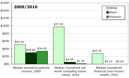
Income and Race by Wealth
from Who Rules America
Then I introduced a bar graph with income and wealth statistics by race. It shows dramatically that the median wealth for black and Latino households is far behind that of white households. Immediately some students questioned the graph. It was using medians, not means, which is an indication of bias. You had to ask why someone would use median to present data as it could exaggerate things. The class discussion devolved into an investigation of data presentation with no acknowledgement of the content being presented. No one wanted to touch the racial components of income and wealth disparities.
I quickly realized I had to extricate myself from a discussion of statistics (of which I know nearly nothing, although I do know that medians are commonly used in presenting data on income and wealth so that extremely high numbers don’t skew the information). So I suggested that someone find statistics on average income by race, which is what they wanted to see, and we’d look at it later. I went on and showed a talk by Tupac Shakur on the distribution of wealth in the U.S. (If you can’t present the information one way, try another!)
All the way home I kept thinking about what happened. It was such a classic example of trying to make facts fit with beliefs. Racial inequality can’t be that bad! There’s always push back on statistics or studies that demonstrate some aspect or another of white supremacy—and not only from my white students. I understand the desire to have it confirmed that in the U.S. we are moving on and leaving racism behind. Over the years of doing the work of illustrating the pervasiveness and tenacity of white supremacy I’ve learned to back off. Arguing with someone is counter-productive. Give them time to let the information be absorbed. Encourage them to go and find statistics to show me that contradict mine.
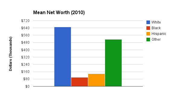
Mean Net Worth by Race
from The American Prospect
By the time I arrived home I had email waiting. A student had found a web page on “The Racial Wealth Gap” that directly addressed the concerns of the class and presented statistics with both mean and median. It completely reinforced the information presented in class. I sent it around to the class email list and we’ll talk on Monday. About resistance to receiving information you don’t want as well as income and wealth inequality by race.
Resources:
G. William Domhoff, Professor of Sociology at U.C. Santa Cruz has a website, “Who Rules America.” The section on wealth has frequently updated statistics and analysis.
For information on income inequality in the San Francisco Bay Area see Sustainable Communities Index.
For information on how rich are the super rich and income inequality nationwide, see Plutocracy Now on the Mother Jones website.
“The Racial Wealth Gap” by Matt Breuning, published on the American Prospect, is the article my student found with several valuable charts and accompanying analysis.
Leave a Reply